
Product Design
Designing User Experience for Virtual Reality (VR)
May 27, 2025

A large-scale digital transformation project aimed at improving how job seekers and employees interact with Randstad’s services. The app provided a seamless experience for managing job searches, timesheets, availability, and communication with recruiters.
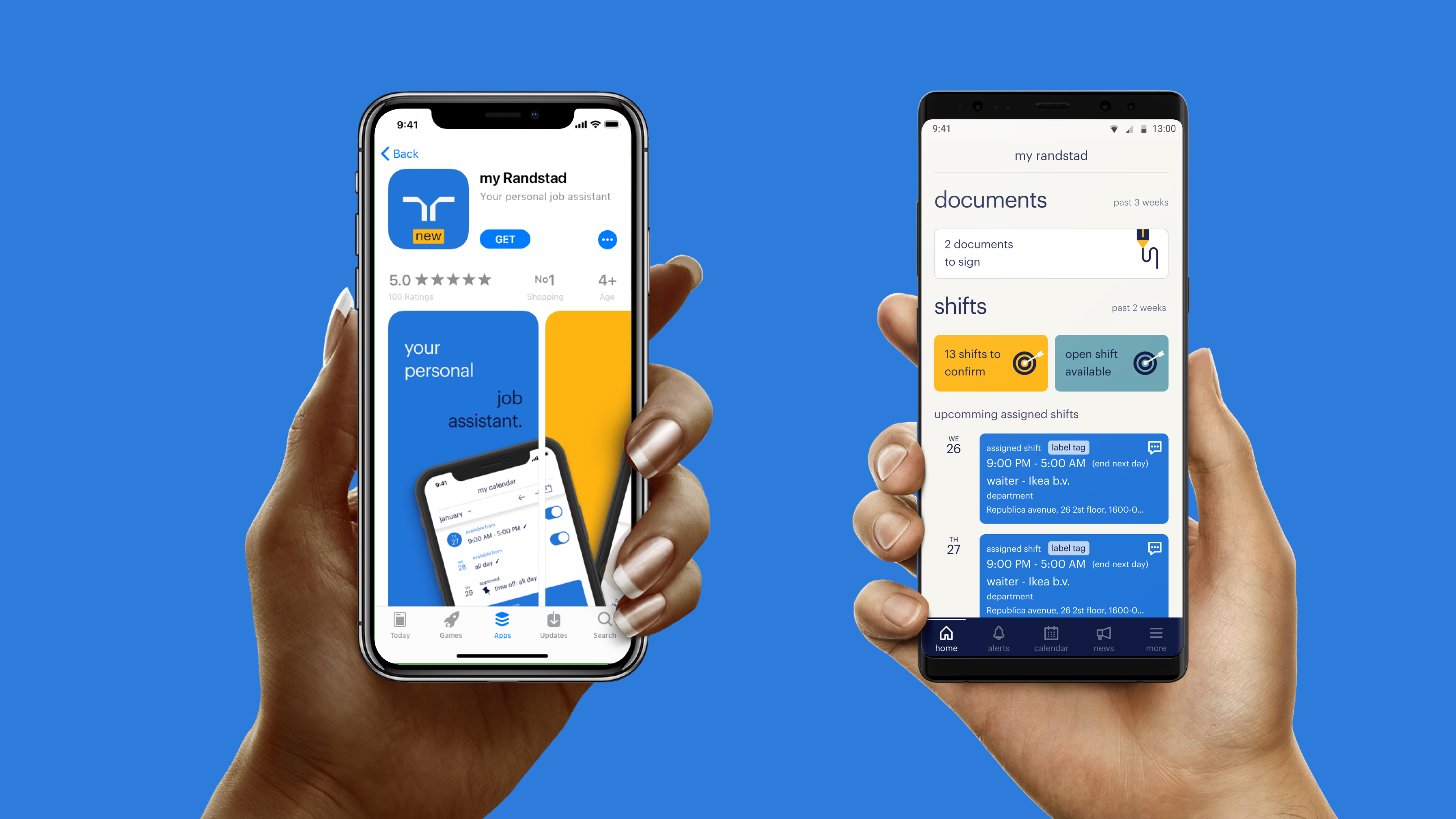
Randstad, one of the world’s largest HR service providers, wanted to create a unified app experience for employees, job seekers, and recruiters. Over three years, I worked as a UX/UI Designer within Randstad, shaping multiple features of the app. My responsibility stretched from early research to wireframing, high-fidelity UI, and building structure and logic.
The app included modules such as Shifts, Timesheets, Calendar, Availability, Job Seeker features, and more. Each was designed to solve a specific problem, but together they formed a consistent, human-centered experience that made it easier for people to work with Randstad.
The Randstad App was designed to be the central hub for employees and job seekers. I contributed across the full design lifecycle from early research and ideation, to prototyping, to high-fidelity UI design.
The app featured modules for job search, shift planning, timesheet submission, and recruiter communication. By unifying these services into one digital experience, Randstad increased both user satisfaction and recruiter efficiency.
Through iterative design and close collaboration with cross-functional teams, we delivered an app that scaled across multiple regions and platforms. The final product became a benchmark for Randstad’s digital strategy, improving engagement and streamlining operations across the company.
Before designing individual modules, I created the general structure of the app, mapping out the information architecture and user journeys. This blueprint allowed us to unify fragmented services like timesheets, job search, and recruiter communication into one connected experience. It also became the foundation for Randstad’s design system, ensuring consistency across iOS, Android, and web.
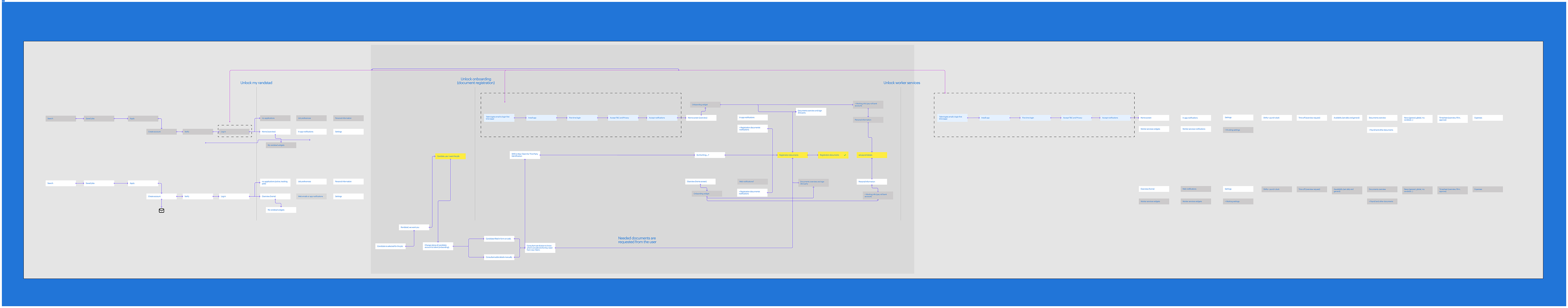
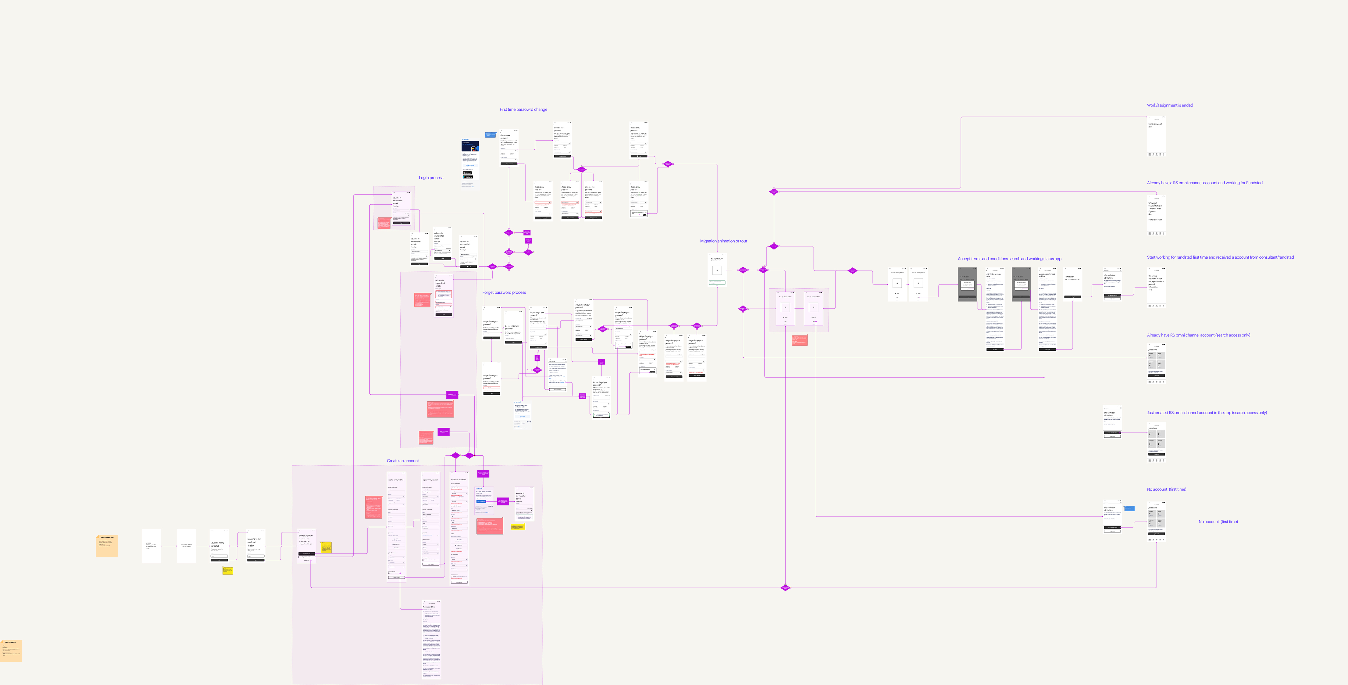
Account creation was one of the most complex journeys in the Randstad app, involving new users, returning employees, recruiter-assigned accounts, and regional compliance requirements. I mapped every possible path from first-time sign-up to forgotten passwords and migration errors to uncover friction points and design smoother solutions.
By simplifying flows, using clearer error messages, and creating reusable components, we reduced drop-off during onboarding and made the process scalable across regions. What seemed like a simple login flow became a foundation for trust, usability, and long-term adoption.
I started with research, interviewing both employees and recruiters to understand their biggest frustrations. For employees, clarity and speed were the top priorities. They wanted to know: When am I working? Where? Who do I contact if something changes? Recruiters, on the other hand, needed confidence that updates would be seen immediately and acted on.
With those insights, I sketched out early wireframes that prioritized the next upcoming shift. Instead of overwhelming users with a long list, the design focused on the most important information first, while still allowing easy access to the full schedule. I also explored how to present last-minute changes in a way that minimized disruption, introducing subtle notifications and status indicators to keep the flow consistent.
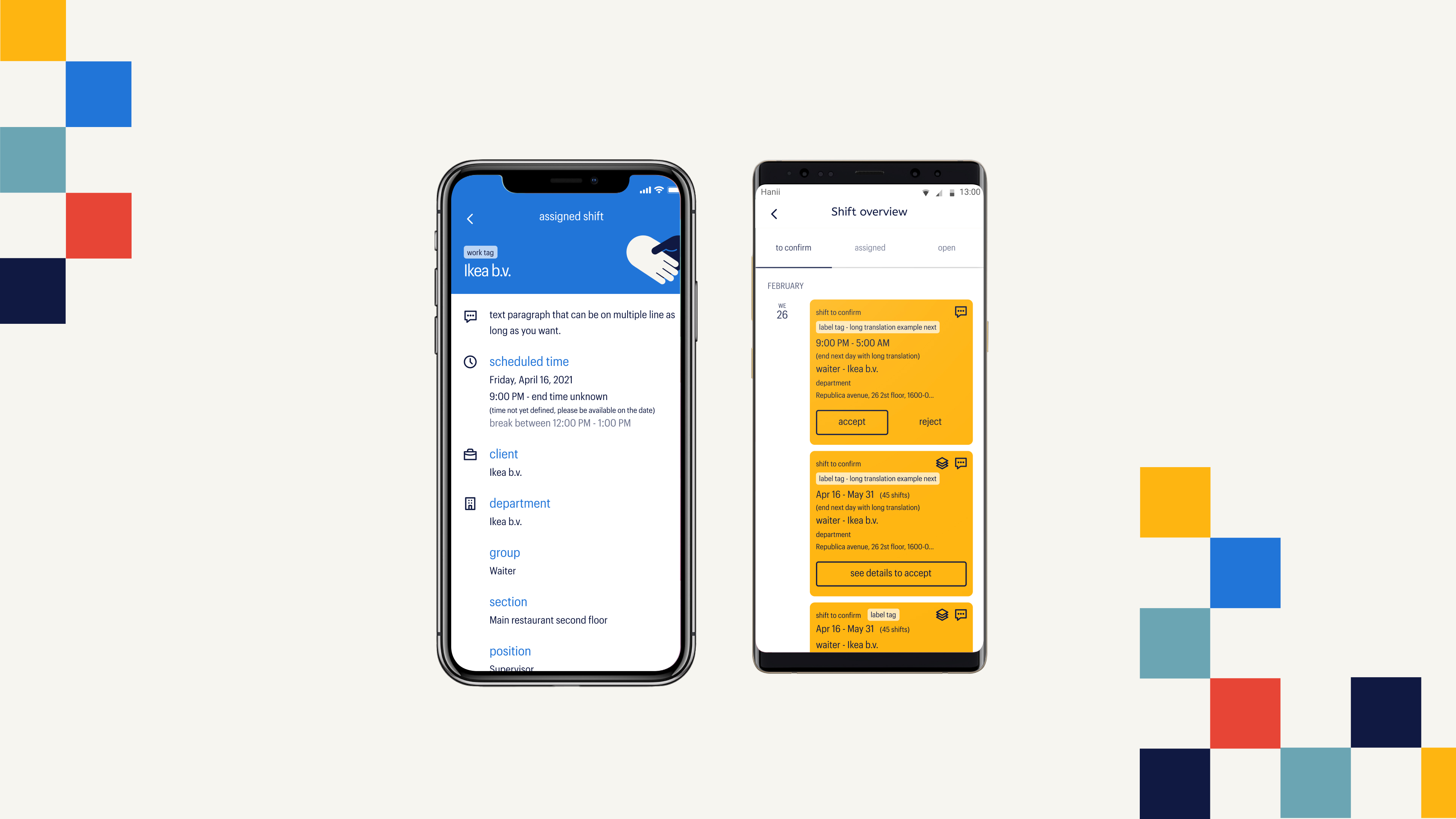
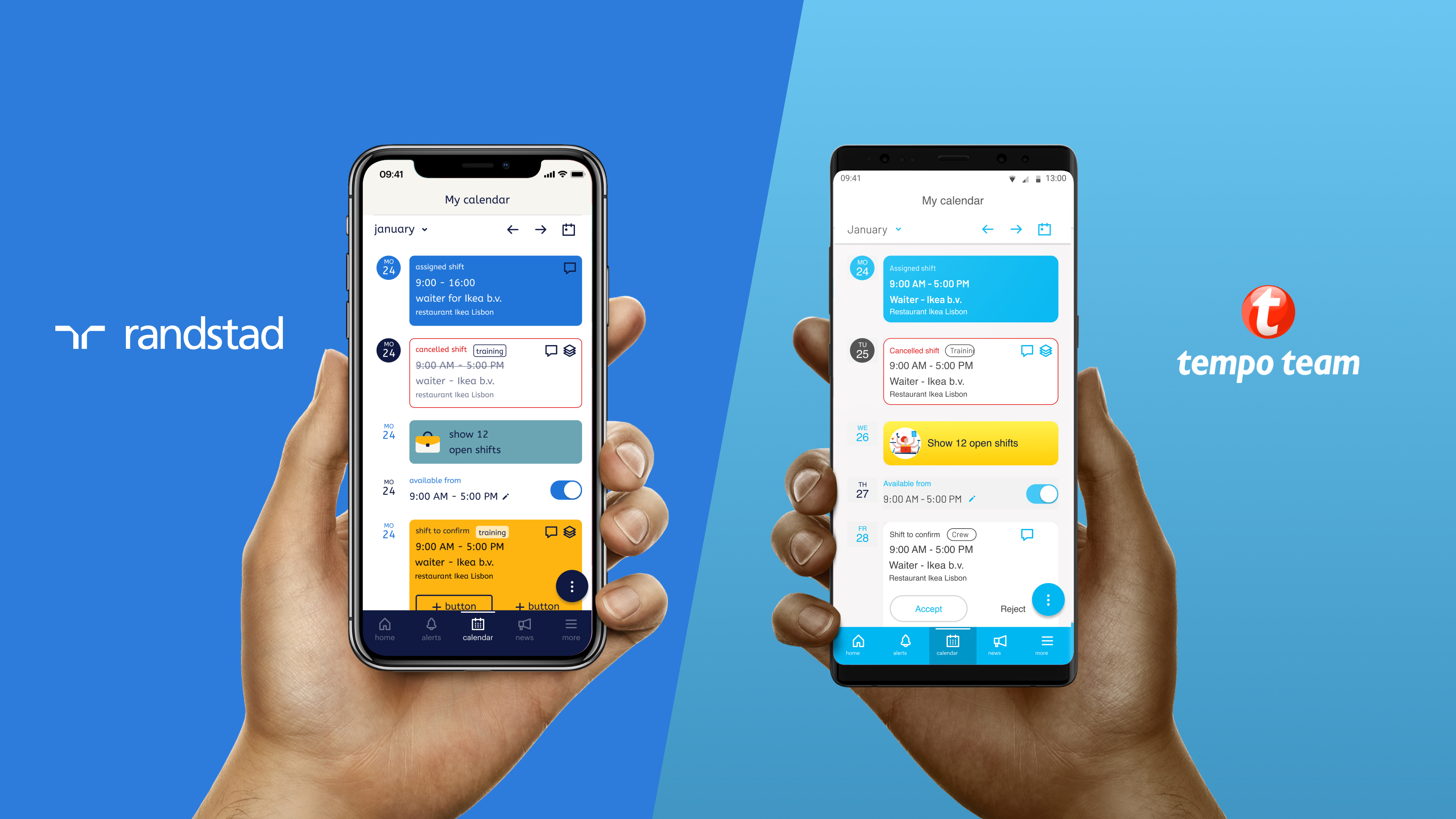
Managing shifts was a constant frustration for employees and recruiters. People relied on phone calls or emails, often missing updates. My task was to design a clear and reliable way to track shifts directly in the app.
I conducted interviews with both employees and recruiters to understand their needs: employees wanted transparency and speed, while recruiters needed confidence that updates were seen. My solution prioritized the next upcoming shift at a glance, with quick access to time, location, and recruiter contact.
Through usability testing, I discovered that confirming a shift took too many steps. By simplifying the flow into a single action, I created a smoother experience that matched the fast-paced lives of employees. The final design reduced missed shifts and built more trust between recruiters and talent.
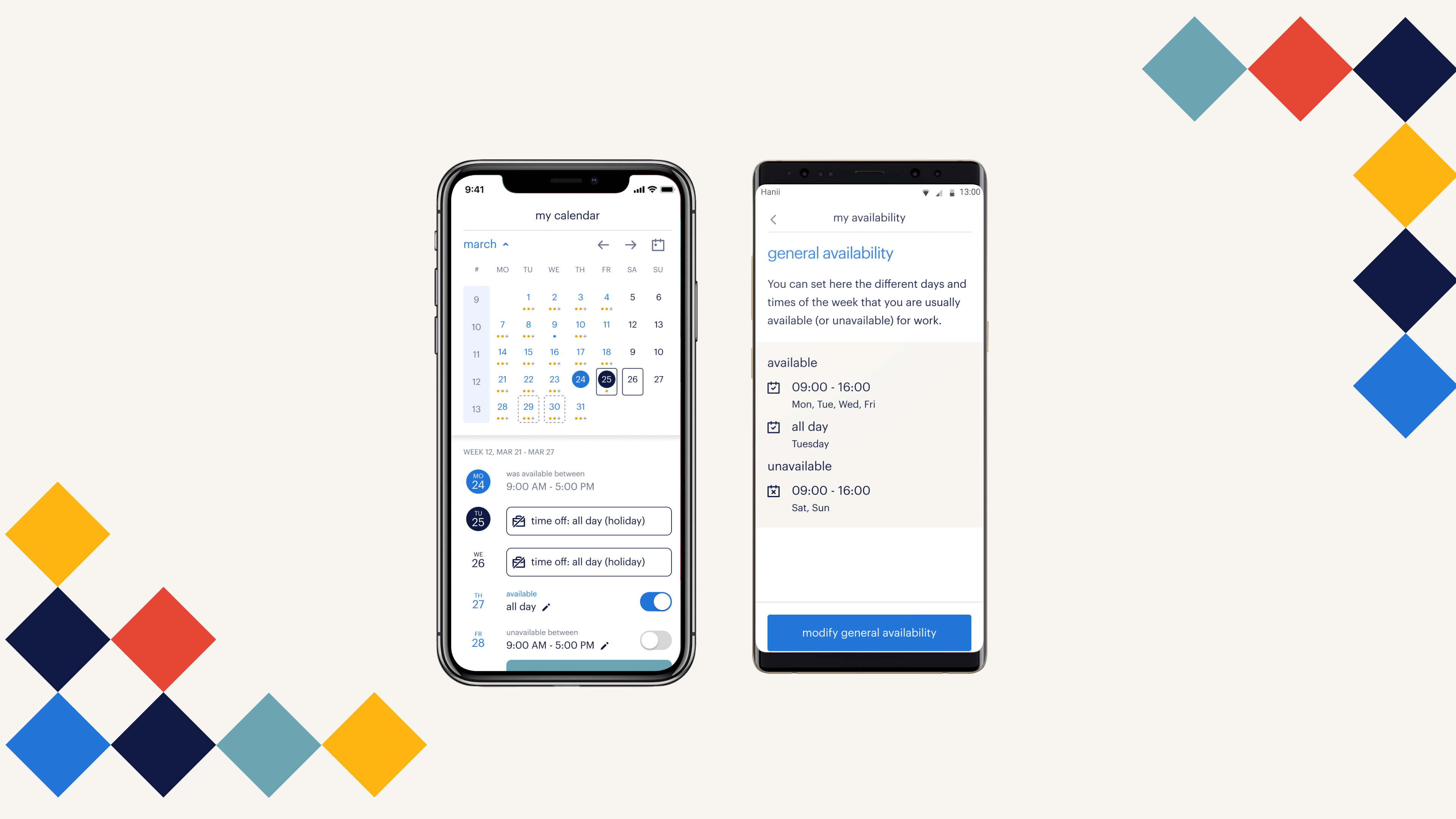
Employees often had to juggle multiple channels to update their availability. The calendar and availability modules solved this by giving users a single, visual interface to set availability and manage time off.
The design focused on simplicity: drag-and-drop interactions, color-coded availability states, and quick actions to request changes. Recruiters could instantly see who was available, making scheduling faster and less error-prone.
Submitting timesheets was one of the biggest pain points for employees. The old process was prone to errors, often delaying payments. I redesigned the flow to minimize friction: fewer fields, real-time validation, and auto-saving progress.
For APAC regions, we introduced localized variations to respect regional compliance requirements. Testing showed that employees could complete timesheets in less than half the time compared to the previous solution.
.jpg)
The Randstad App became the central hub for employees and job seekers. Adoption grew across multiple regions, errors in timesheets dropped significantly, and recruiters reported smoother communication with talent.
For Randstad, the app was more than a product it was a digital strategy milestone that positioned the company as a leader in HR technology.

Randstad Group operates multiple staffing brands, including Randstad and Tempo-Team. Each brand needed its own distinct look and feel, but the core app experience had to remain consistent for usability and scalability.
Design a flexible multi-brand framework that allows the same app to serve different brands, maintaining brand identity while reusing shared UX patterns and components.
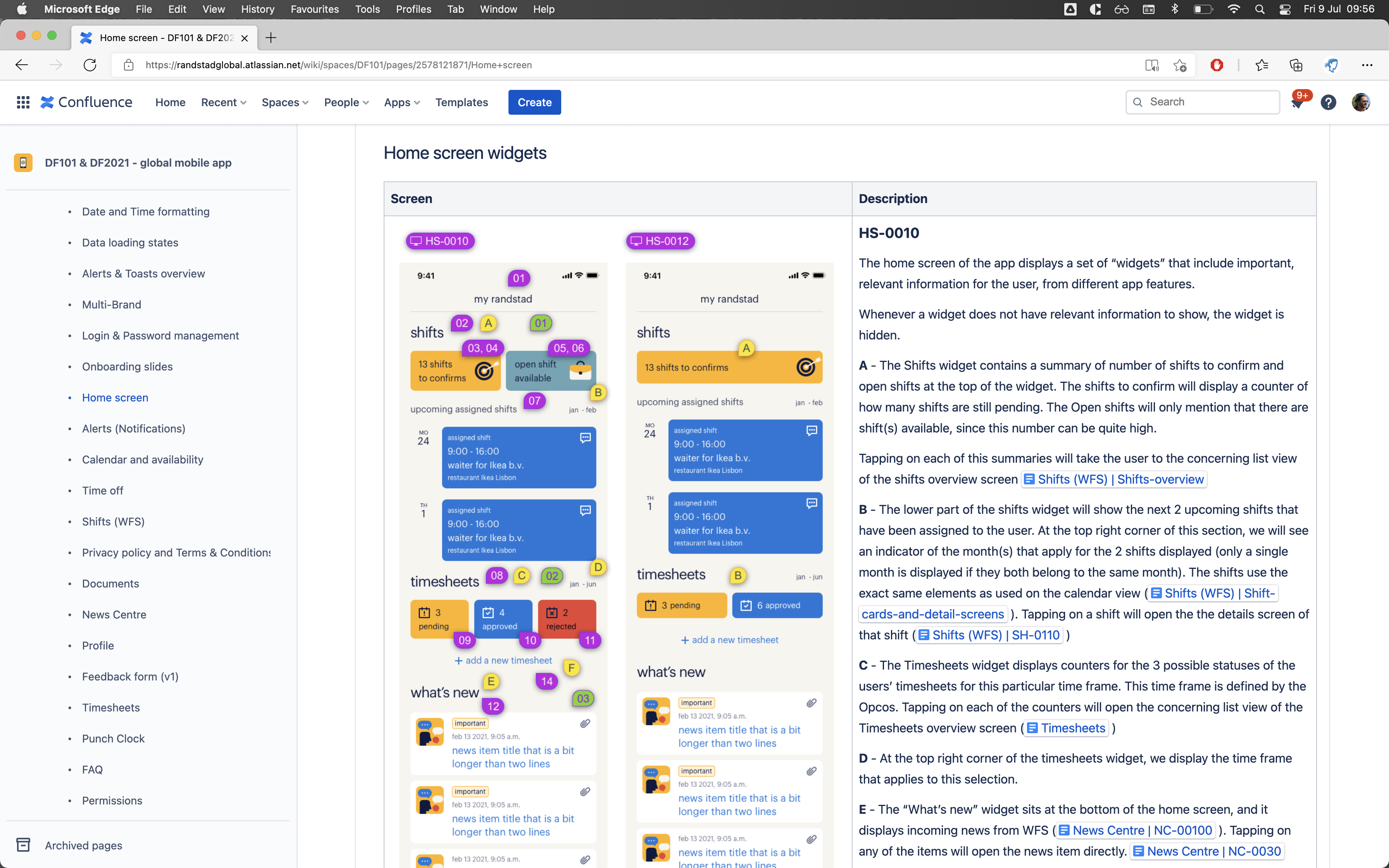
I documented each feature in Confluence with annotated screens, behavior descriptions, and edge cases, ensuring developers and stakeholders had a clear single source of truth. This reduced misunderstandings, improved consistency across regions, and helped the Randstad app scale smoothly.
This project reinforced the importance of designing for both sides of a system. Employees needed transparency and simplicity, while recruiters needed control and reliability. The design struck a balance by focusing on the shared goal: keeping everyone aligned and reducing friction. I also learned that small UX refinements like reducing confirmation steps can create an outsized impact on adoption and user satisfaction.
geek out together about your project or upcoming product.


